Category: Uncategorized

  • ShopMate

    ShopMate

    Overview

    Super App helps people build a shopping list and compare the total basket price across nearby supermarkets and small local stores. Prices are kept fresh through community updates, supported by a simple trust layer (recency + verification), so users can make a confident decision fast.

    The Problem

    Most shoppers want to save money, but:

    • Prices change frequently, so information becomes outdated fast.
    • Existing solutions mainly focus on big chains and often ignore local minimarkets.
    • Even when data exists, users hesitate because they don’t know if it’s reliable.

    Goals

    Make basket-based comparison the default (not just item-by-item).

    Expand coverage to small stores via community input.

    Add credibility signals so users can trust the results.

    Keep the experience lightweight and fast.

    My Role

    I led the end-to-end process: research → definition → flows → wireframes → UI → interactive prototype.
    Tools: Figma (components + design system + prototyping).

    Process

    I framed the core job as: help users decide where to buy their basket now, without turning the experience into “research mode.”
    This shifted the focus from “price browsing” to a clear primary action: Compare Basket.

    2) Research (Qualitative + Competitive Review)

    I ran short interviews and reviewed existing solutions (comparison tools, shopping list apps, community groups).
    Key takeaways:

    • People care about the total basket more than individual deals.
    • Trust is a major blocker: users want to see when prices were updated and how many people confirmed them.
    • Community contribution must be extremely low-effort, or it won’t happen.

    3) IA & User Flows

    I designed an MVP around four core actions:

    1. Find an item (search / barcode scan)
    2. Build a list (quantities, categories)
    3. Compare basket across stores (ranked results)
    4. Submit a price (fast, structured, verifiable)

    4) Wireframes → Iteration

    Wireframes helped validate clarity and speed:

    • Reduce steps before reaching a meaningful result
    • Make “submit price” feel optional but easy
    • Ensure trust indicators are visible without adding clutter

    5) UI & Design System

    UI principles:

    Reusable components (Product Card, Store Card, Price Chip, Trust Badge)

    Fast readability (clear hierarchy, strong primary CTA)

    Trust without heaviness (small, consistent credibility cues)


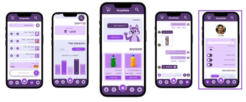
    Final Solution (MVP)
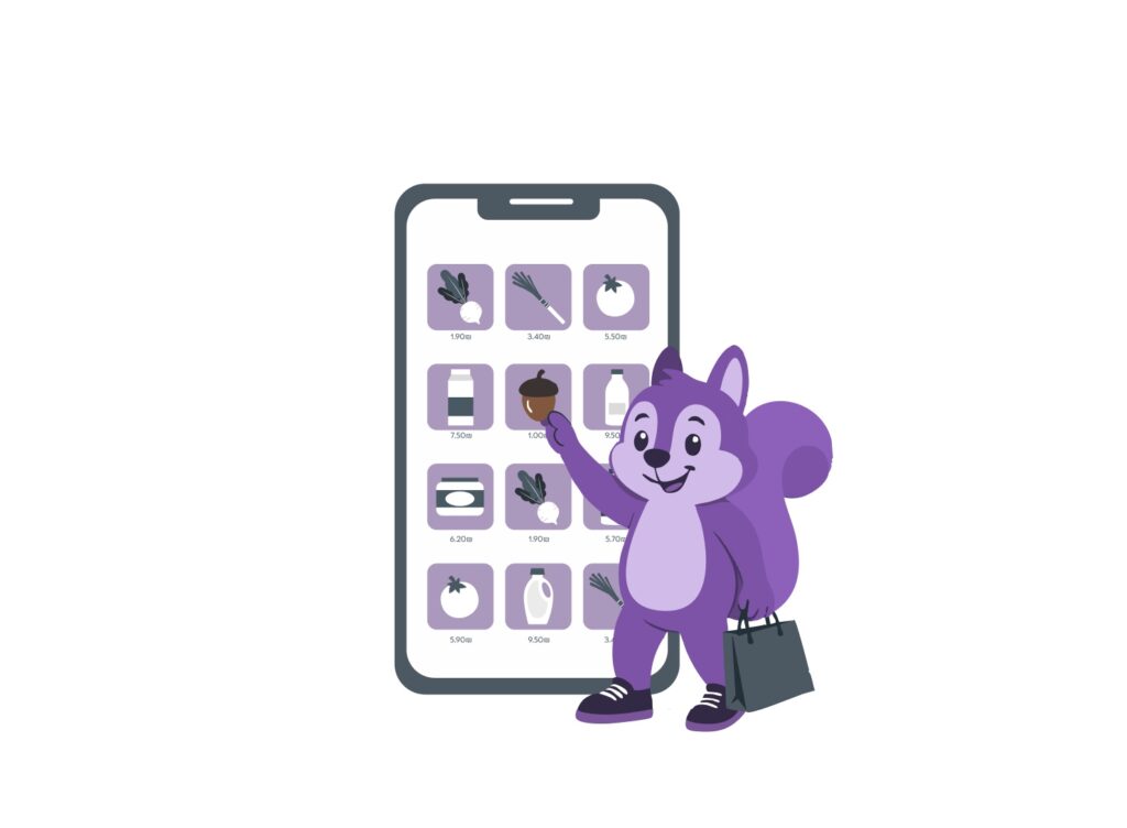
    Smart Shopping List

    Users add products quickly (search/barcode), adjust quantities, and keep a ready-to-compare basket.

    Basket Comparison

    A ranked store list shows:

    • Total basket price
    • Distance / travel time
    • Last updated
    • Verification count (and flags for suspicious reports)

    Community Price Updates

    A short flow to submit prices with optional proof (photo/receipt), timestamping, and community verification.

  • through the frame

    through the frame

    Through the Frame — Art Therapy Space for Young People After the War

    Overview

    Through the Frame is a conceptual project created in response to the war in Israel, designed for a young audience. The idea is an art-therapy space for people affected by the war — a safe place to process emotions through creation, supported by guided sessions and a welcoming community environment.

    The Concept

    Participants take part in art-based workshops and open studio time to express what they’re going through. The artworks created in the space can later be curated and sold (with full consent), turning creative expression into empowerment — while also helping fund and sustain the initiative.

    My Contribution

    I helped shape the concept and translate it into a clear experience — from the user journey and messaging to the visual direction and final presentation.


  • MindTrek

    MindTrek

    MindTrek — Branding Concept (Nature × Psychedelic)

    Overview

    MindTrek is a brand concept built for young explorers who live between nature, travel, and alternative culture. The goal was to create a visual identity that feels both grounded and otherworldly—a brand that can sit on a backpack, a hoodie, a sticker on a water bottle, or a poster on a wall, and still feel like a complete universe.

    MindTrek blends outdoor symbolism with psychedelic energy: calm at its core, expressive at the edges.

    The Idea

    Most outdoor brands communicate performance, toughness, and “extreme” energy. MindTrek takes a different approach: a spiritual, playful, and aesthetic guide for the journey—less military, more mindful.
    The identity is inspired by:

    • organic nature forms (woods, trails, animals, fungi)
    • sacred geometry and ritual-like symbols
    • psychedelic culture and self-expression (without turning into chaos)

    Audience

    Young adults (roughly 20–30) who:

    • travel, hike, camp, or go on spontaneous nature trips
    • attend festivals / alternative events
    • value freedom, creativity, and community
    • want their style to feel personal—not generic “outdoor gear”

    Brand Values

    • Freedom & exploration
    • Connection to nature
    • Self-expression
    • Community energy
    • Mystery + curiosity (a brand that invites discovery)

    Visual System

    Logo & Symbols

    The identity uses a symbolic language built from:

    • a deer as a “spirit guide” (instinct, navigation, softness + strength)
    • mushrooms as a sign of growth, transformation, and the unseen layers of nature
    • geometry elements that act like “maps,” portals, or protective marks

    The logo system is designed to be modular: a main mark + secondary icons + stamps/seals.

    Color Palette

    A mix of earthy neutrals (for grounding and readability) with neon accents (for the psychedelic spark).
    The contrast creates a “tribal-cosmic” vibe: natural but futuristic.

    Typography

    Type is treated like a trail sign: clear, functional, and minimal—paired with expressive graphical details (patterns, stamps, iconography) to keep the identity alive.

    Patterns & Textures

    MindTrek uses repeat patterns that feel like:

    • topographic maps
    • sacred geometry grids
    • organic textures (dust, grain, paper, stone)

    Patterns are meant to work across print, fabric, and digital surfaces.

  • שוטר פושע והענק הלוחש

    שוטר פושע והענק הלוחש

    עיצוב מחדש לתקA redesign project that translates an album into a document system from the frontlines of memory, fear, and hope

    In this project, I chose to take an album that already feels like a complete world—“Cop, Criminal and the Whispering Giant” by Rami Fortis—and build a new visual language for it—one that understands the emotion of the music through material, format, and typography, not only through a single cover image. Instead of treating the “cover” as one fixed frame, I approached the album as a dossier from a specific time: a collection of evidence, notes, reports, testimonies, and memories.

    The conceptual foundation draws direct inspiration from war—not as a decorative motif, but as a mental state that breaks everyday life into fragments: partial information, short messages, torn documents, things written too fast or erased too slowly.


    The core idea: each song is a different document

    Rather than printing the lyrics as a standard booklet, each song was printed on a different document—different size, different format—chosen to “sound” like the song. That decision turned reading into a physical, staged experience: you don’t only read the words—you open them. Each page feels like it was pulled from a different folder: a police file, a hospital file, a military record, someone’s drawer, a personal notebook, or a sheet found on the street after a long night.

    This creates a situation where the album isn’t told only through a linear sequence of tracks—it’s revealed through a collection of objects. Each song gets a different weight in your hand, takes up a different volume in space, and triggers a different reading rhythm—just like songs trigger different emotional tempos.


    Visual language: war as texture, not illustration

    The war inspiration enters through signs of material and time: wear, layering, repairs, stains, stamps, margin marks, and the “technologies” of bureaucracy and systems. I leaned into the aesthetics of real documents—ones born from operational need, not artistic intention—then gently disrupted them with more personal moments: handwriting, tears, erasures, misaligned text, rough edges, or the “silence” of empty space.

    The design moves between two poles:

    • The system / mechanism — order, forms, stamps, filing, authority.
    • The human inside it — chaos, fear, dark humor, impulse, survival.

    That collision fits an album filled with extreme characters and situations—sometimes feeling like a theater piece inside a reality that’s already absurd.


    Format as psychology: why different sizes change the story

    Every format carries psychological meaning:
    A small sheet feels like a secret or a hidden message. A large sheet feels like a statement—like a poster or a report you can’t ignore. A narrow strip feels like a receipt or a quick record. Thick paper feels like something you shouldn’t throw away.

    When the songs are printed in different formats, the listener/reader begins to ask questions:
    Who wrote this? Where did it come from? Why does it look official? Why does it feel personal?
    Without over-explaining, a second narrative forms around the album—a story of a fractured reality, where each song is “another document” from a larger case.


    Typography and materiality: between a typewriter and a scream

    Typography functions as an additional voice. I combined a language of reporting/documentation (sharp headings, form structures, rigid alignment, numbered sections) with moments where the text “breaks”—unexpected spacing, headlines that feel like shouting, cut lines, words placed like a wound.

    Instead of beautifying, I searched for material truth:
    A document can be clean and still terrifying. It can be rough and still precise. The goal wasn’t “pretty design,” but design you can feel.


    User experience: opening an album like opening a case file

    The package (or the album as a set) was built like a filing system—something you can pull pieces from, arrange, return, and feel like you’re holding a story in your hands. The experience begins with a simple action: extraction. Each song is a moment of discovery, and each discovery is slightly uncomfortable—like reading something you’re not sure you were meant to find.


    What I learned from the project

    This project taught me how design can translate music without illustrating it directly. Instead of “drawing the song,” I tried to design the conditions in which the song could have been written: the time, pressure, tone, atmosphere, the surrounding system—and the human being crushed inside it.

  • gozilla

    gozilla


    GODZILLA — App Concept + Design Process 🦖📱

    פרויקט עיצוב אפליקציה שמתרגמת את העולם של גודזילה לחוויה דיגיטלית: חזקה, אפלה, “גדולה מהחיים” — אבל עדיין נקייה, ברורה ומזמינה לשימוש.

    מה האפליקציה עושה?

    האפליקציה בנויה סביב חוויית מעריץ/קהילה: מקום שבו אפשר לגלות תוכן, לשמור רגעים, ולהרגיש חלק מיקום אחד של מפלצות.

    פיצ’רים מרכזיים (הקונספט):

    • Feed / Discover – זרם תוכן של תמונות, קטעי וידאו, פוסטרים וארט של גודזילה.
    • Profile – פרופיל משתמש עם שמירות, פוסטים ואוסף אישי.
    • Search – חיפוש מהיר לפי סרטים/דמויות/רגעים.
    • Favorites / Collections – שמירת תכנים ובניית “אוסף” כמו אלבום מפלצות.
    • Post / Share – העלאת תוכן והשתתפות בקהילה (שיח, לייקים, תגובות).

    המטרה הייתה ליצור אפליקציה שמרגישה כמו “הזמנה להיכנס לעולם” — לא עוד דף מידע, אלא חוויה.


    השפה החזותית: מפלצת ענקית בתוך מערכת UI מסודרת

    בתמונה שהעליתי רציתי להראות בדיוק את השילוב הזה:
    מצד אחד דמות חזקה ותוקפנית (Godzilla), מצד שני גרפיקה מודרנית ונקייה שמרגישה כמו מוצר אמיתי.

    החלטות עיצוביות מרכזיות:

    • פלטת צבעים ירוקה שמחברת מיד לעולם של טבע/איום/רדיו־אקטיביות (תחושת “מפלצת קלאסית” אבל מודרנית).
    • צורות אלכסוניות ברקע שמוסיפות תנועה ואנרגיה בלי להעמיס.
    • טיפוגרפיה ענקית (GODZILLA) כדי לתת תחושה של סקייל — משהו גדול מהמסך.
    • אייקון קווי של גודזילה בתחתית כחותמת מותג (פשוט, מזוהה, זכיר).
    • CTA ברור: GET THE APP — כי זה נראה כמו פרסומת אמיתית לאפליקציה קיימת.

    למה גודזילה בתוך המסך נראה “מכאני” / קולאז’י?

    בחרתי להציג את גודזילה כדמות שמורכבת מהרבה חלקים קטנים — זה נותן תחושה של:

    • עוצמה ומסה (כאילו הוא בנוי משכבות)
    • עולם קשוח ותעשייתי
    • פריים שמרגיש כמו פוסטר/סיפור, לא רק תמונה

    זה גם יוצר קונטרסט מעניין עם UI נקי: מפלצת “כאוטית” בתוך מוצר מסודר.


    תהליך עבודה (Workflow)

    ככה בניתי את הפרויקט מהשלב הראשון עד לתוצר הפרסומי:

    1) הגדרת בריף קצר

    • מי המשתמש? מעריצים / חובבי קולנוע / אספני תוכן
    • מה הצורך? למצוא תוכן איכותי, לשמור, לשתף, להרגיש קהילה
    • מה הטון? עוצמתי, אפל, “קולנועי” — אבל שימושי

    2) רפרנסים והשראה

    אספתי כיוונים משני עולמות:

    • אפליקציות תוכן/קהילה (מבנה ניווט ברור, אייקונים מוכרים, פיד)
    • שפה קולנועית של מפלצות (קונטרסט, דרמה, צבעוניות ירקרקה)

    3) ארכיטקטורת מסכים (IA)

    בניתי את השלד של האפליקציה:

    • בית / גילוי
    • חיפוש
    • יצירת פוסט
    • לייקים/שמורים
    • פרופיל

    4) Wireframes → UI

    אחרי שהמבנה היה ברור עברתי לעיצוב:

    • היררכיה טיפוגרפית נקייה
    • כפתורים ואייקונים פשוטים
    • מרווחים שמאפשרים “לנשום” למרות שהדמות במסך מאוד דומיננטית

    5) מוקאפ פרסומי

    בשלב האחרון יצרתי פוסטר שיווקי שמראה את האפליקציה כאילו היא באמת יוצאת לשוק:

    • מסך בתוך אייפון
    • טייפ גדול של שם המותג
    • אייקון מותג + קריאה לפעולה

    מה רציתי להשיג בתוצאה הסופית

    ✅ אפליקציה שנראית כמו מוצר אמיתי
    ✅ חיבור חזק בין “עולם המפלצות” לבין חוויית UI מודרנית
    ✅ פריים פרסומי שמספר סיפור בשנייה אחת: זה GODZILLA — תוריד את האפליקציה

  • Star seeders

    Star seeders

    Star Seeders is a brand for festivals/raves and for people who live between nature and the city — between spirit and matter.
    The sunglasses are a “gateway”: you put them on, and you enter a higher dimension.

    Brand promise (one sentence):
    The look of an alien. Everyday comfort. Dancefloor presence.

    Design language: Galactic–Tribal

    I wanted the shapes to feel like something that landed from another planet — but still a real product that works:

    Colored lenses → frequency, mood, a night/sun vibe.

    Sharp geometry / faceted surfaces → a sense of technology, armor, precision.

    Ritual symmetry (the “third eye” composition) → a mystical dimension, a totem-like presence.

    A dark, massive frame → presence, power, status.

    Why the “third eye”?

    Star Seeders’ icon is about frequency and awareness.
    I chose to turn that symbol into a structural element that appears in the eyewear itself — as if you have an “extra module” above your eyes: something that signals you’re part of the tribe, and that you show up with presence.