עיצוב מחדש לתקA redesign project that translates an album into a document system from the frontlines of memory, fear, and hope
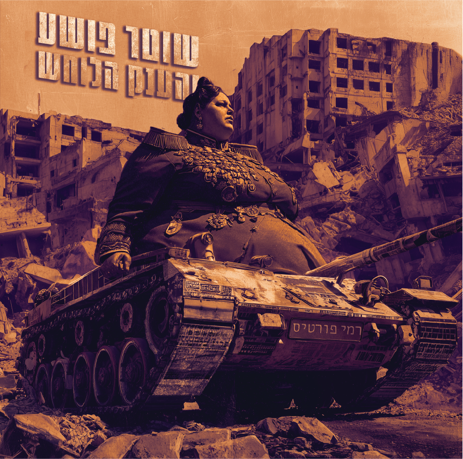
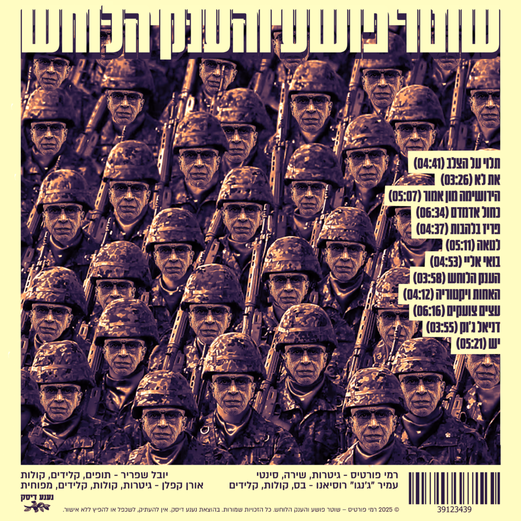
In this project, I chose to take an album that already feels like a complete world—“Cop, Criminal and the Whispering Giant” by Rami Fortis—and build a new visual language for it—one that understands the emotion of the music through material, format, and typography, not only through a single cover image. Instead of treating the “cover” as one fixed frame, I approached the album as a dossier from a specific time: a collection of evidence, notes, reports, testimonies, and memories.
The conceptual foundation draws direct inspiration from war—not as a decorative motif, but as a mental state that breaks everyday life into fragments: partial information, short messages, torn documents, things written too fast or erased too slowly.
The core idea: each song is a different document
Rather than printing the lyrics as a standard booklet, each song was printed on a different document—different size, different format—chosen to “sound” like the song. That decision turned reading into a physical, staged experience: you don’t only read the words—you open them. Each page feels like it was pulled from a different folder: a police file, a hospital file, a military record, someone’s drawer, a personal notebook, or a sheet found on the street after a long night.
This creates a situation where the album isn’t told only through a linear sequence of tracks—it’s revealed through a collection of objects. Each song gets a different weight in your hand, takes up a different volume in space, and triggers a different reading rhythm—just like songs trigger different emotional tempos.
Visual language: war as texture, not illustration
The war inspiration enters through signs of material and time: wear, layering, repairs, stains, stamps, margin marks, and the “technologies” of bureaucracy and systems. I leaned into the aesthetics of real documents—ones born from operational need, not artistic intention—then gently disrupted them with more personal moments: handwriting, tears, erasures, misaligned text, rough edges, or the “silence” of empty space.
The design moves between two poles:
- The system / mechanism — order, forms, stamps, filing, authority.
- The human inside it — chaos, fear, dark humor, impulse, survival.
That collision fits an album filled with extreme characters and situations—sometimes feeling like a theater piece inside a reality that’s already absurd.
Format as psychology: why different sizes change the story
Every format carries psychological meaning:
A small sheet feels like a secret or a hidden message. A large sheet feels like a statement—like a poster or a report you can’t ignore. A narrow strip feels like a receipt or a quick record. Thick paper feels like something you shouldn’t throw away.
When the songs are printed in different formats, the listener/reader begins to ask questions:
Who wrote this? Where did it come from? Why does it look official? Why does it feel personal?
Without over-explaining, a second narrative forms around the album—a story of a fractured reality, where each song is “another document” from a larger case.
Typography and materiality: between a typewriter and a scream
Typography functions as an additional voice. I combined a language of reporting/documentation (sharp headings, form structures, rigid alignment, numbered sections) with moments where the text “breaks”—unexpected spacing, headlines that feel like shouting, cut lines, words placed like a wound.
Instead of beautifying, I searched for material truth:
A document can be clean and still terrifying. It can be rough and still precise. The goal wasn’t “pretty design,” but design you can feel.
User experience: opening an album like opening a case file
The package (or the album as a set) was built like a filing system—something you can pull pieces from, arrange, return, and feel like you’re holding a story in your hands. The experience begins with a simple action: extraction. Each song is a moment of discovery, and each discovery is slightly uncomfortable—like reading something you’re not sure you were meant to find.
What I learned from the project
This project taught me how design can translate music without illustrating it directly. Instead of “drawing the song,” I tried to design the conditions in which the song could have been written: the time, pressure, tone, atmosphere, the surrounding system—and the human being crushed inside it.
Leave a Reply